


Artwork: "Depth of My Passion"
Posted: Tuesday June 2nd, 2009
by
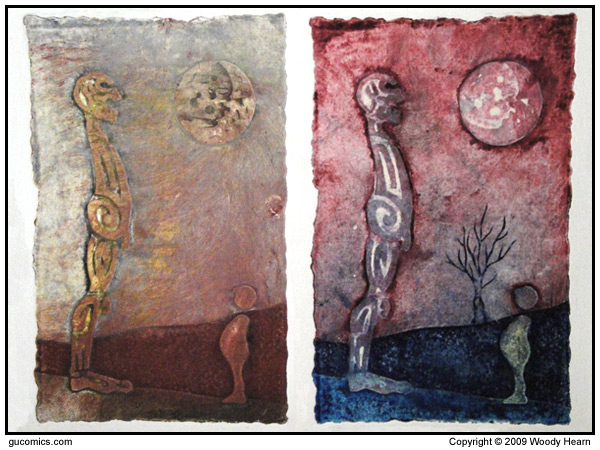
Since I was allowed to skip most my entry level college art classes (thanks AP Art program). I was thrown directly into things like beginning print making. I loved it. I've got a lot little prints from that first year. But by far, my favorite process from the time was this embossed series. I can't remember what the process was called, but you built up layers of mat board, coated the whole thing in a water proof/ink proof sealant, whiped various ink colors onto the "plate", then ran it through the press. The pressure from the press would force the inks to blend and move, but the varying layers allowed some colors to stay in place. The layers also embossed the paper. The final result is very interesting.
Since all of the pulls were one of a kind, you didn't really title each print. You titled the plate. I called this one "... and that was the depth of my passion.". The idea was that this kid has found an old monument to the past that spoke of a life and time long past. Symbolically, the sun has set and the relics story has come to a close. The body shapes of the kid and the skeleton were inspired by Ernest Trova's Falling Man series of prints.
I also did a 3 color series (to demonstrate a grasp of using registration marks) parody of Trova's work that used his body shapes but added on elements indicative of a native american, cowboy, construction worker, and police officer, using a tomahawk, lasso, hammer, and hand cuffs to suggest the presence of their uhmm... exposed genetalia. I called it "Falling Men at Work". The older folks in the crowd will get that.
Before I leave you for the day, let me also demonstrate one of my failures. This was my first go at Intaglio printing: Ku'Mokth. Intaglio is a time consuming process of seal plate, sketch into sealant, etch in acid... lather, rinse, repeat until you have your final image. The more times you seal, sketch, and etch an area, the darker that area is when you wipe in ink and print the plate. So my "failure" here was in not creating enough contrast in the image. An okay first attempt maybe, but ultimately it fell short of what I wanted. I did get a good grade though; so, I guess I shouldn't whine about it too much. It should probably be noted that none of of my experiences with intaglio went well. **whistles**
[ discuss ]
[ top ]

- advertise on gu -